Keeping It Simple. The KISS Rule
The Kiss Rule stands for…. Keep it Simple Stupid. Rude, abrupt straight to the point.
Like a slap across the face but in there is a lot of truth in that statement.
I really think the main meaning behind the Kiss rule is that most systems and ideas work best when you keep them simple. It’s never a benefit to you if you complicate things. Usually a complicated system doesn’t work well.
So if your systems are simple and work smoothly and perfectly, there’s no need to add anything to it as it may not work as well as it did beforehand.
Are you in the Stupid Category?
The very first time I heard about the KISS rule I was taken a-back because for one thing…I didn’t’ think I was stupid, (others might think differently on that issue).
So now I personally like to refer to it as Keep it Simple Sonny
Past tense me would think that the harder and more complicated things were the better I must be at getting my work and designs done.
But on further analysis….. Working smarter and not harder is the motto I like to follow…well most of the time.
How To Create a KISS Design
When I like to start designing or making a social post, web graphic, email header, eBook etc, I tend to look at what others in my field are doing. It’s ok to look and get ideas from those who do similar things in your field, …… but…..oh yes this is a BIG BUT…..I can get myself into a massive pickle and get a tad overwhelmed .
You are you and they are different to you. Similar but different. And that’s when I get all confused, cant put together a simple design and everything goes AWOL.
This is when I like to stop, pause, and then apply KISS. I actually think this thought in my head….. it’s time to get back to basics and I ask myself what was the original point of my design in the first place?
How To Keep it Simple Designing Graphics
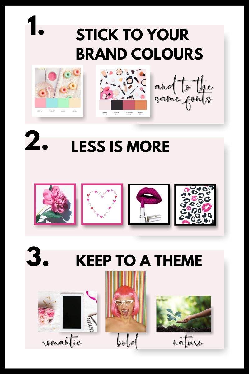
I’ve found 3 things that will help you when designing or working on your graphics.

1. Stick to Your Brand Colours and Fonts
Most of us have a colour palette that is for our business. I usually have black, white and 2 main colors and a pop colour. (good for buttons on your web and highlights you need to emphasize. If you are sharing social media posts, graphics on your website and email lists it’s so much easier designing with those colours in mind. You don’t go off on a tangent and end up creating images that aren’t a fit with your branding and logo.
2. Why Less is More
Oh man, …….. I love the less is more approach. I’ve been known to go a tad overboard with trying to get my followers attention. Hey, they already follow and like you so it’s more important to share awesome content that isn’t distracting rather than crazy weird designs, colours, images that don’t really fit in with your brand image. (I’m taking serious notes here).
Now I’m making a little confession here.e….. I’m one of those BSOS kind of gals. (Bright Shiny Object Syndrome). If there is anything that I think will grab my follower’s attention I may pop something random up to draw attention to my profile.
But in reality people dislike change and get used to the same colours, images and fonts of your brand and tend to look for that. And if we mix our designing up too much we can not only get ourselves confused but also our fab followers and clients too.
Stick to your brand. It’s going to save you a lot of heartache.
3. Stick to One Theme
So, by a Theme what I mean is your kind of style and tone of your marketing.. So, are you a Romantic with your graphics? Or are you more a “nature gal”?. Some of us are ecofriendly and love those earthy kinds of colours and feels.
So probs what I’m saying is if you have a style then stick to it as it becomes so much easier to create your designs and graphics for your marketing.
By having a theme and applying the KISS rule, you’ll be so much clearer and productive and it’ll also keep you on track and on the straight and narrow.
Need Some Colour Branding Help?
If you would love a free Mood Board Template to keep you in tune with your colours you can grab one here
I do love and recommend Canva and if you would love to Free Canva Account you can get one here.


0 Comments