Choosing Your Business Brand Colors
Choosing brand colors for your business is essentially like choosing your logo. The colors will represent you and your business and give an overall feel and style.
But most often we just don’t know what colors to pick for our branding.
You’ve either tried too many colors or the wrong colour palette which somehow has never seemed to be a real fit for you.
Or maybe…
You see someone else’s business branding color scheme on their Instagram or Pinterest pages and think …yeah that’s me and copy their colors to make them your own.
The only problem I see with that is that even though you love the look of other social media pages, they aren’t you. Your business and your branding are just that….. YOU!!
Why Do You Need Brand Colors for Your Business?
The reason you need to have brand colors is to have continuity with your creations so there’s no mistaking that it’s your business.
It’s your digital or (literally) physical business card. People identify with certain fonts and colours in your posts, images, blogs, stationary and website.
Branding From Iconic Companies
And one of the best examples of recognitions from big brands is Coca Cola. Yep, red and white and the same font year after year.
What about Channel? Black with a hint of gold and the classic double CC’s.
Very recognizable and stand out from the crowd. I know you are probably thinking I’m not big like Coca Cola.
But the lesson is still the same no matter how big or small you are.
Enter your details below to grab your free Mood Board template.
How Do You Choose Brand Colors for Your Business?
To make choosing your branding colors super easy and simple, l’m going to ask you to look around your environment.
- What do you constantly seem to be drawn to?
- Is it a certain type of home styling like the Hampton’s?
- Or are you more of a Boho look kinda gal?
This may seem like it has nothing to do with your business branding but if you think about it and are constantly drawn to certain images and styling. then that must be important to you.
Next….. What do you seem to love to look at while out shopping?
Are gorgeous green leafy illustrations, plants and flowers your thing? Or do you find you are always drawn to hot pink and teal striped makeup bags?
What about jewelry, and clothing? Black 1950’s dresses or more casual straight legged denim jeans.
Think about the kind of stationary you like. Flowery fonts that are embossed with rose gold or naturals like brown paper, hessian and jute twine.
So I hope you can see that those things are really a big part of you and to take note of those recurring themes and bring that into your branding colors.
Canva’s Color Palette Generator Tool
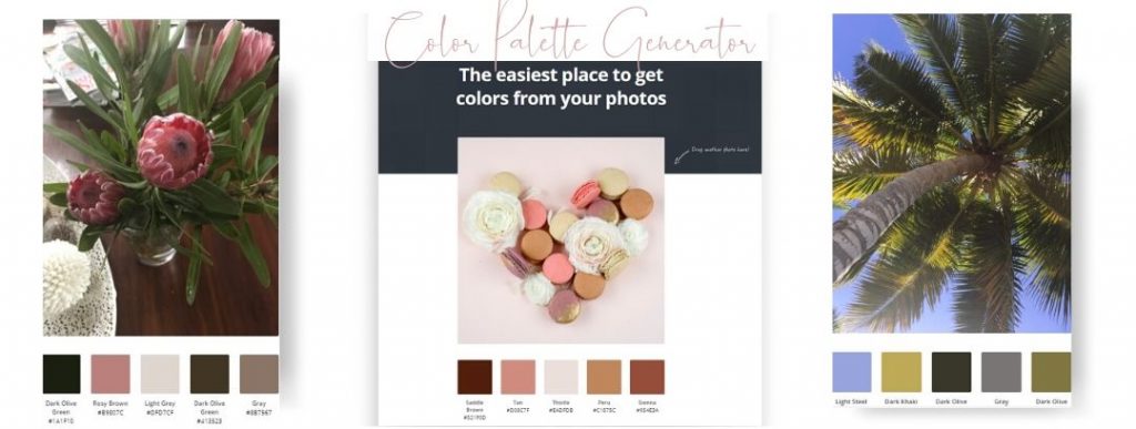
Another easy way to quickly pick colors is to use a Color Palette Generator Tool. If you have a fave photo you can load it up to Canva’s Color Palette Generator and it will automatically pick 5 colors and give you the hex code numbers too. (more on hex codes further down the post).

Take A Que From Your Fave Mentors
Think about the people and businesses you follow. Do you follow them because you like their posts, colours and styling? Well that might be the things that you really like too.
I love Joanna Gaines and her styling from the show “The Fixer Upper”. Wood, dark metal, white accents with lots of green plants and vases full of flowers.
I may not have the same colour scheme, font’s or imaging for my own business, but it is a theme that I love.
Choosing Your 5 Brand Colors.

5 is like the magic number when it comes to colours. 2 Staples | 2 Signature colors | 1 Pop color.
I usually like to pick a white and a charcoal for my basic staple colours.
(not a hard and fast rule here but it’s easy to use these colors to start with if you are finding it a bit tricky).
These staples colors work great for any website, Instagram, or social media page, and stationary. Then I like to pick two signature colours.
Choosing Your 2 Signature Colors
So, mine are Pink and Green. (Mind you I don’t love every pink and green). So when you pick your two Signature colours find the tone that best fits with you.
Your Business Pop Color
And lastly pick a Pop Color. This is the color that you randomly use throughout your posts and content to make your followers take notice.
It’s not usually used a lot, only when you need to draw attention to something like a button on a website – Grab your freebies. Go to cart etc.
I follow Denise Duffield Thomas and she has as her main colours shades of beautiful blues.
When you see a photo of her In all her posts, blog images and website, she will always be wearing either clothing in that colour, or a patterned version.
You’ll see a candle jar or photo frame in the blue tones on the coffee table in the image. Her jewelry usually has that teal/blue coloring in them too.
If you need some direction about keeping things simple you can pop on over to my article on the KISS rule here.
Mood Board
The easiest way to help you choose your brand colors, fonts and elements is with a mood board.
If you would love to have a try and play with colors and images you can use the Mood Board templates from my link to Canva.
All yohttp://canva.7eqqol.net/kxYoVu have to do is type into the search on the home page “Mood Boards” and templates and inspiration will be there a plenty.
I’ve included an example below for you to spark some inspo.

Add your fave photos, squiggles or dots, plants, textures and things that spark that feeling of “it’s me”.
Pop in your fave fonts as well. Choose one a font for the body of your text, a font for the header and a handwriting font too.
What if You’ve Already Chosen Colors You Don’t Love?
If you don’t really love your colours but have loads of stationary to use up first and can’t get your website updated, then work with it instead of against it.
Tip For Updating Brand Colors
Try and add a new color into the mix that blends in with what you have to vamp up the original color scheme on your social media pages first.
Even though you may be stuck with your stationary’s old color scheme, your digital graphics can be edited slowing introducing the new color.
If you decided to change your mind, then digital is easier to change. Give yourself a little time before committing to a whole new colour scheme straight up.
I’ve often been totally convinced thinking that a tone of pink I’ve used was beautiful and a few day later regretted it.
If you would like to try a mood board and map it out first in Canva. Find the hex codes, write them down in a safe place or spread sheet and stick with them when you’ve made your final decision.
Check Your Tone
Are your social media posts in the same tone? Let’s assume you have green in your branding. Do you always stick to the same green or do your graphics have lots of different tones greens throughout?
If it’s a bit all over the shop look at the green that gives you the best feeling. If it’s not say…. lime but rather the mint green, well that might give you a hint that you need to use that as one of your colours and ditch any other green.
Every colour you use has a name called a Hex code.
If you don’t know what colour that green is (or any colour you would like to find) you can find it’s hex code (that’s the 6 digit and letter combination given to a colour shade).
I’ve popped in a link to the Canva Color Wheel below that helps you choose colours and find the hex code of those colors. It’s so helpful and will also give you other
options for three colour combinations, or a similar complimentary tone of a color you like.
https://www.canva.com/colors/color-wheel/
So Just Recapping The 5 Color Tip.
2 Staple colours – Charcoal (or black) and White
2 x Signature Colors
1 x Pop Color (used sparingly).
Most of have some creative fun and look around to what you really love and are drawn too. It’s easier than you think and the possibilities endless. 😊


0 Comments